

Project PING
Role: Senior UX Designer
Team: Product & Technology
Focus: UX Research · Information Architecture · Interaction Design · Usability Testing · Responsive Design
Employees had plenty of information. Finding the right information was the problem.
Expedia’s employee platform had become difficult to navigate, making it harder for people to find important content and complete everyday tasks.
As a Senior UX Designer, I owned the UX and UI process for redesigning the responsive web platform — from research and information architecture through interaction design, prototyping, and usability testing.
Working with a cross-functional Product & Technology team, I focused on one central challenge:
Make the information employees needed easier to find, understand, and act on.
FINDING WHERE PEOPLE WERE GETTING LOST
Analytics showed that three areas were used most frequently: Search, Daily challenges, Articles
That gave us a starting point but not the full picture. I interviewed employees across different roles and locations in the UK and US to understand how they actually used the platform, what they looked for most often, and where the experience was getting in their way.
The problem wasn’t a lack of content. It was making the right content visible at the right moment.
TURNING RESEARCH INTO CLEAR PRIORITIES
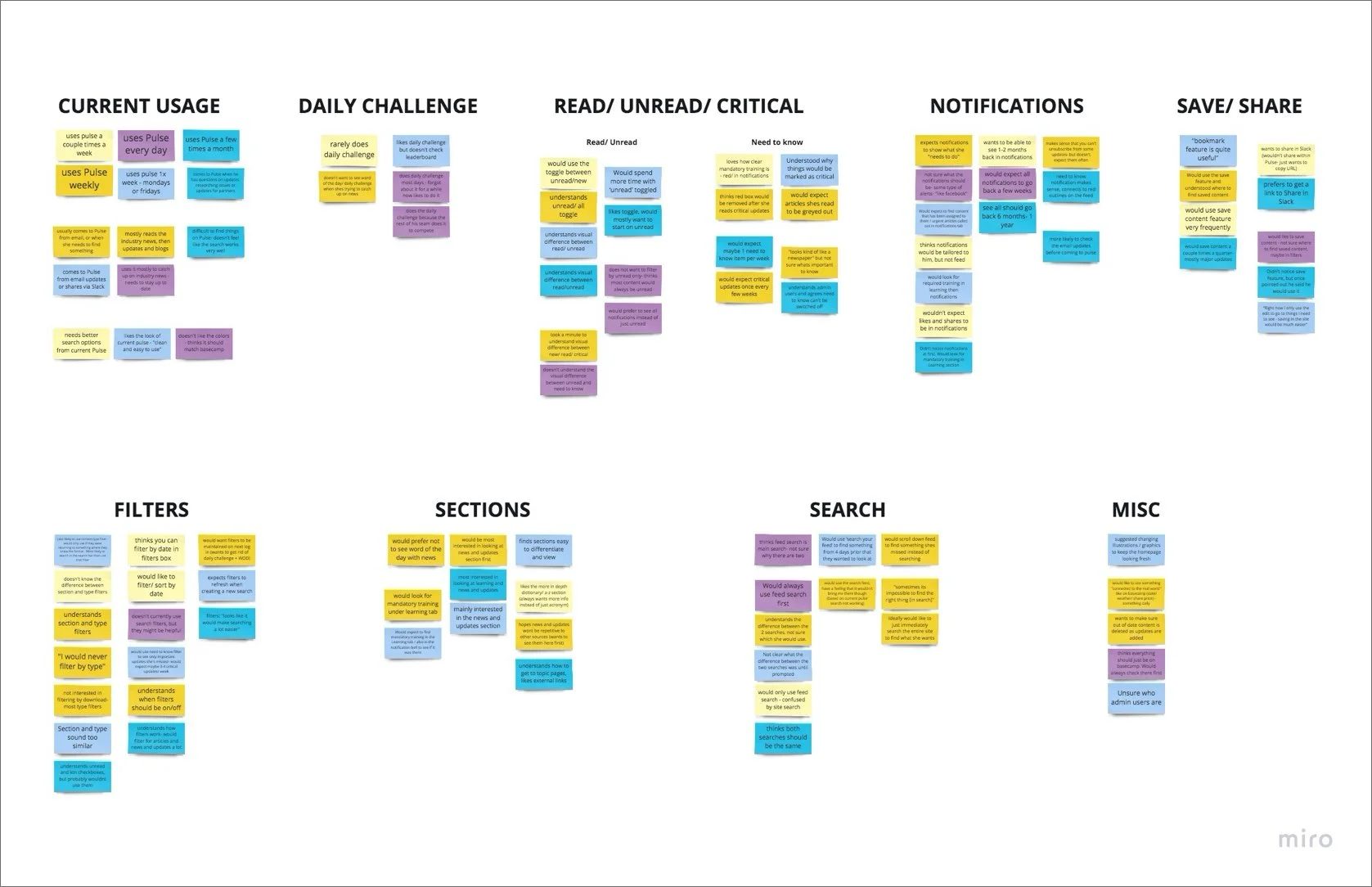
I synthesized the interviews through affinity mapping, looking for patterns in how employees searched, discovered content, responded to notifications, and navigated the platform. Four opportunities emerged and these became the foundation for the redesign.
TURNING RESEARCH INTO CLEAR PRIORITIES
Make search easier to find and more effective
Make important content harder to miss
Make notifications clearer and more relevant
Make frequently used content easier to access
RETHINKING HOW INFORMATION WAS ORGANIZED
FROM A PORTAL TO A MORE USEFUL FEED
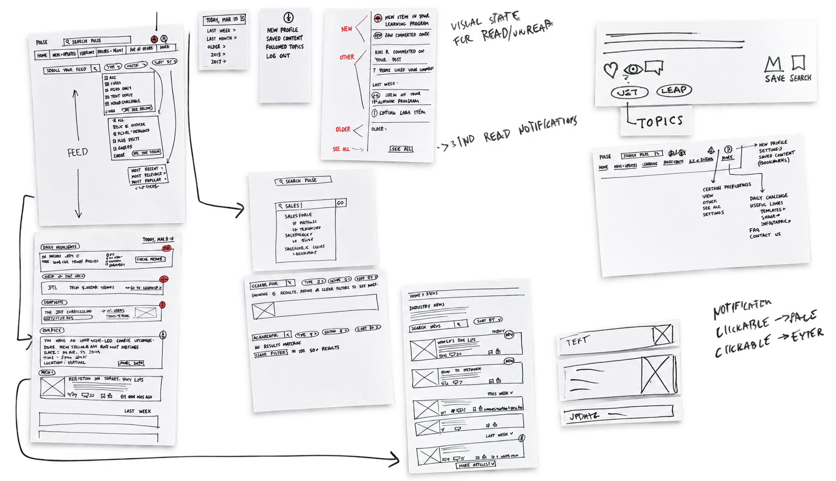
I began exploring a feed-based experience that could bring frequently used and important content closer to the surface. Rather than expecting employees to know exactly where information lived, the interface could do more of the work for them. I explored different approaches to: Content hierarchy, Search, Filtering, Notifications
The goal was to create an experience that felt easier to scan — while still giving employees ways to dig deeper when they needed to.
SIMPLIFYING SEARCH
Early concepts included separate searches for the overall site and the feed. Testing revealed that distinction could create confusion.
If employees had to stop and decide which search to use, we were adding another problem before they could solve the first one.
I refined the search experience to make finding content feel more direct and intuitive.
MAKING FILTERS EASIER TO UNDERSTAND
Filters could help employees narrow down large amounts of information — but only if people understood what they were filtering and why. Early feedback showed that the purpose of the filters wasn’t always clear. I refined their structure and presentation so they became a useful shortcut rather than another layer to interpret.
The tools for finding information needed to be as clear as the information itself.
MAKING IMPORTANT INFORMATION HARDER TO MISS
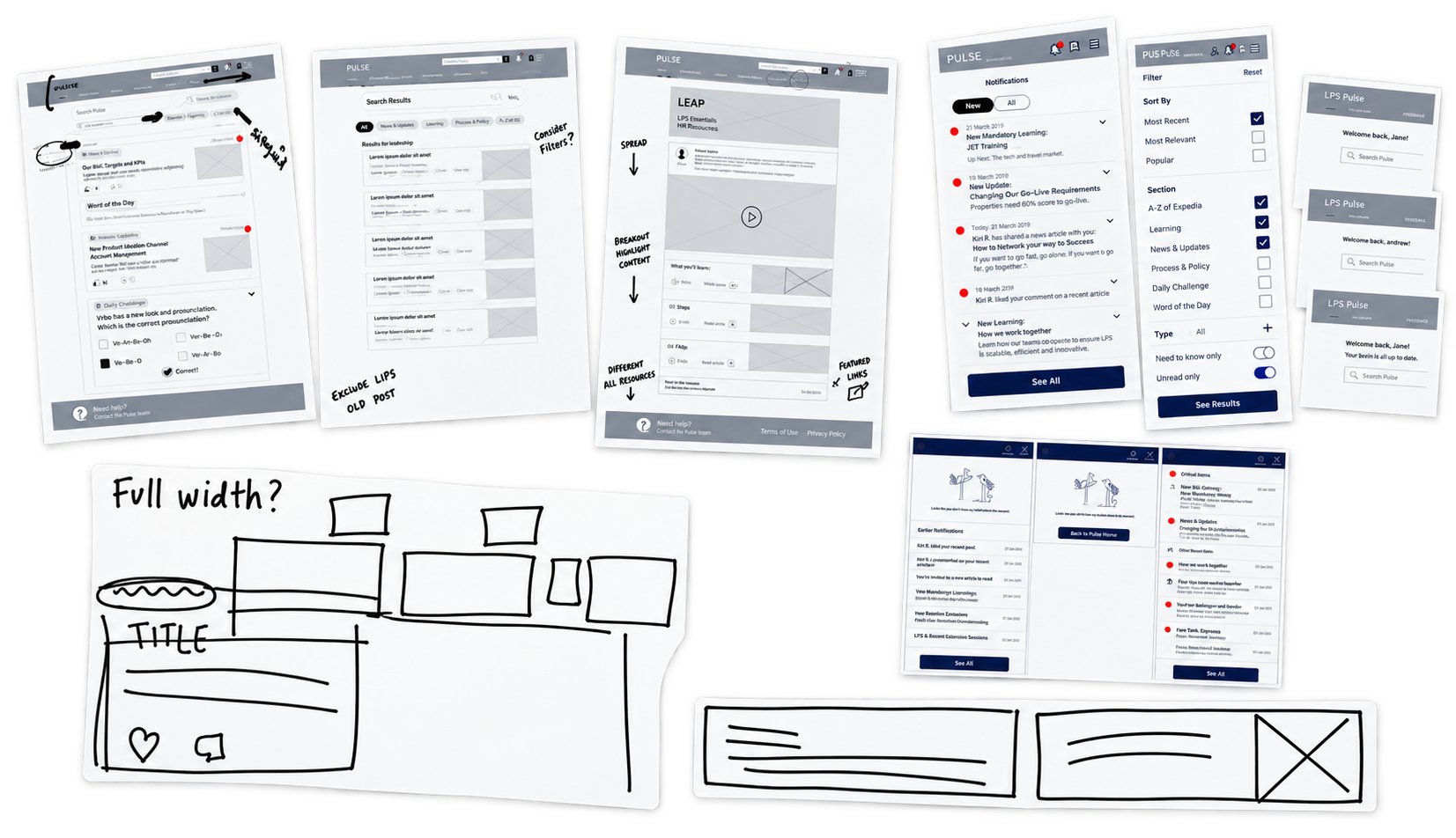
Employees were seeing many different kinds of content, but some information required more immediate attention than others. I explored visual and interaction patterns that made differences in importance easier to recognize at a glance.
Notifications also needed to clearly communicate:
What was new
What was important
What required attention
The aim was to help employees quickly separate “good to know” from “I need to act on this.”
TESTING THE EXPERIENCE
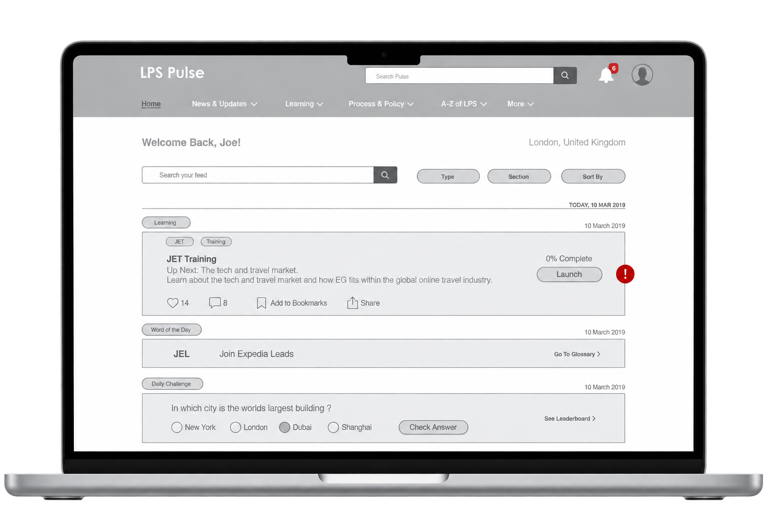
I tested the wireframes with 10 employees across Expedia offices around the world.
The research focused on whether the proposed feed, search, filtering, and notification patterns actually supported the tasks employees needed to complete.
The findings helped identify where the experience still created uncertainty and informed the next round of design.
Rather than assuming the new structure was clearer, we tested whether people could actually use it.
TURNING INSIGHTS INTO THE FINAL EXPERIENCE
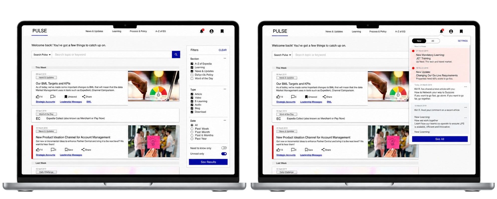
I translated the research and usability findings into high-fidelity designs, refining:
Information hierarchy
Search
Filtering
Notifications
Content priority
I applied Expedia’s brand guidelines while also aligning the experience with patterns employees already knew from other internal tools.
The redesign needed to feel new enough to work better — but familiar enough that employees didn’t have to relearn everything.
DESIGNING FOR EVERY SCREEN
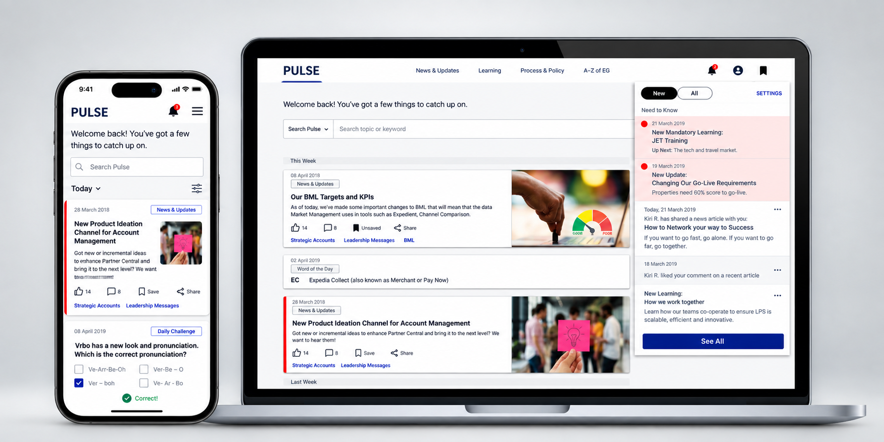
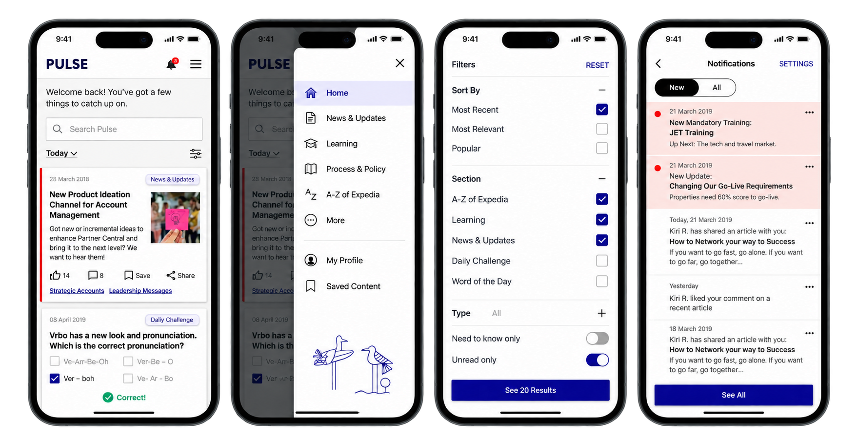
Employees needed access to the platform whether they were sitting at a desk or checking something on the go. I translated the core experience across desktop and mobile, adapting navigation, search, filters, and notifications while preserving the same hierarchy and ease of use.
The screen could change. The ability to find what mattered shouldn’t.
THE RESULT
LESS HUNTING. MORE FINDING.
The redesigned experience brought frequently used content closer to the surface, gave employees clearer ways to search and filter, and made important information easier to recognize. Across the project, every design decision came back to the same goal:
Help employees spend less time looking for information — and more time using it.
The right information. Easier to find.