


Private banking can involve complicated decisions and transactions. The digital experience shouldn’t make them feel that way.
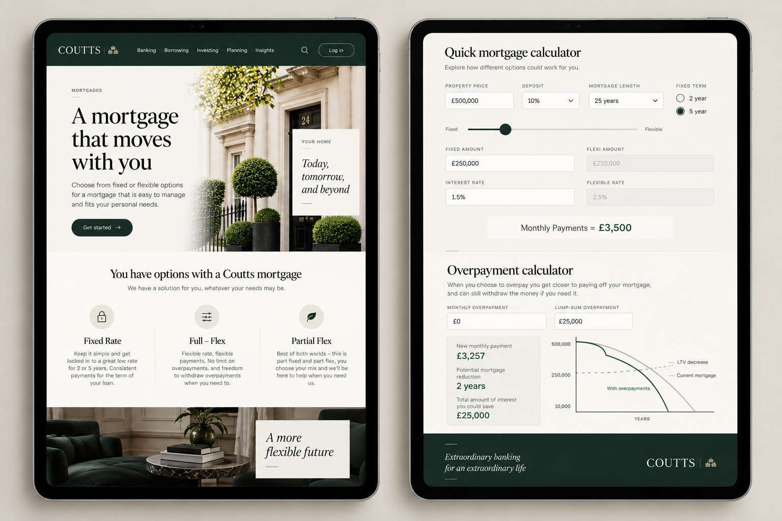
As a UX Designer at Coutts, I worked on a new iOS app and web platform for private banking customers. Working with product, business, and development teams, I designed and prototyped experiences that made everyday banking tasks easier to understand and complete- from ordering foreign currency and getting help to managing a more flexible mortgage. Three examples of that work are highlighted below:
Foreign Currency Request · Chat & UI · Flexible Mortgages
Foreign Currency Request
Role: Senior UX Designer
Team: Product, Business, iOS Development
Focus: Making foreign currency ordering easier
MAKING A COMPLEX TRANSACTION FEEL STRAIGHTFORWARD
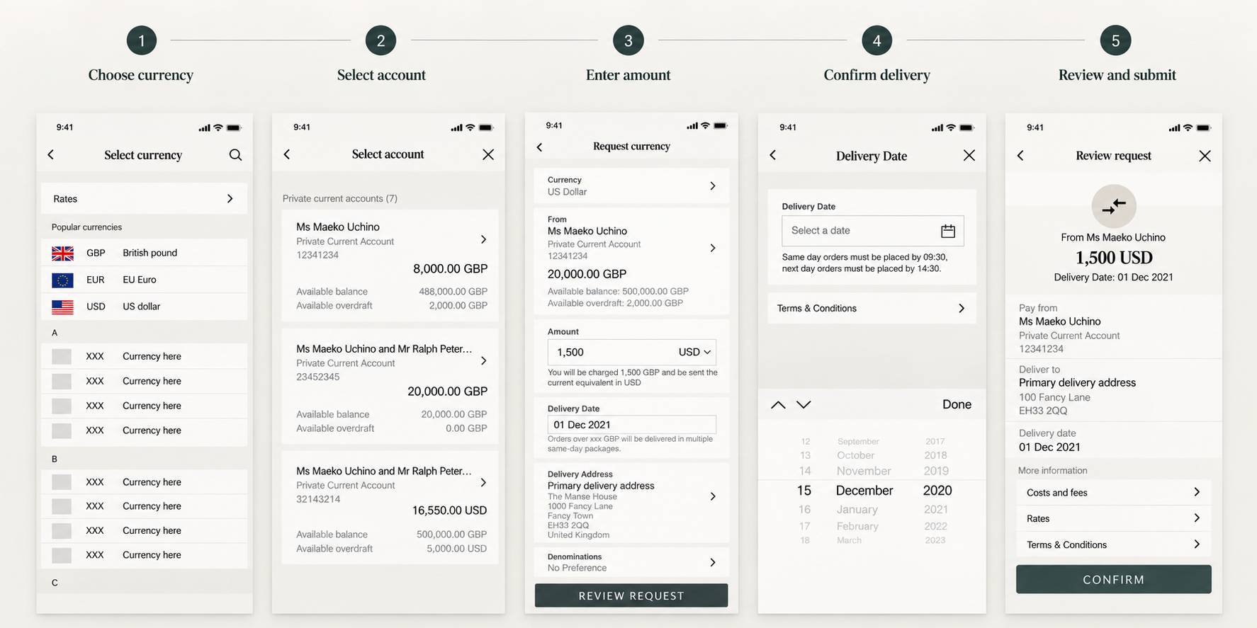
Ordering foreign currency involved several decisions: which currency, which account to use, how much to order, where it should be delivered, and finally reviewing everything before committing. The challenge was to make all of those steps feel simple and predictable.
I designed a new iOS experience that guided customers through the transaction in a familiar, checkout-style flow. Each step focused on one decision at a time, while giving customers enough information to understand where they were and what would happen next.
The complexity remained behind the scenes. The customer experienced a clear path forward.
MAKING CONFIRMATION FEEL CONFIDENT
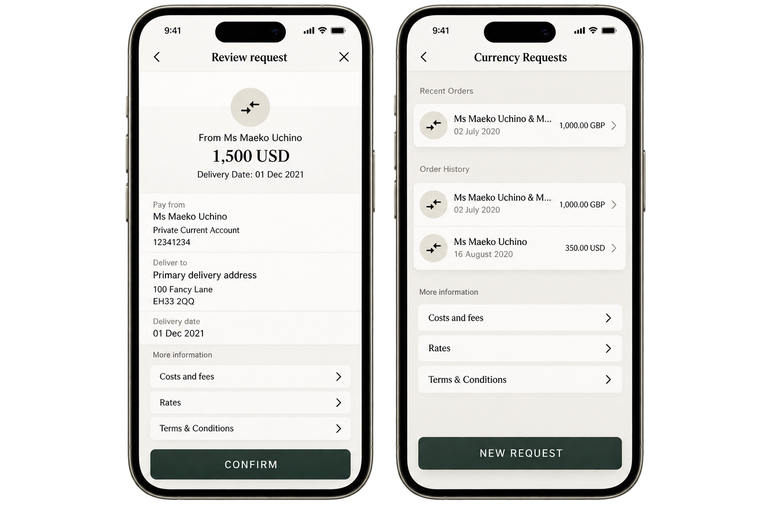
With a financial transaction, simplicity isn’t just about fewer steps. Customers also need to feel confident that they’re doing the right thing.
The final review gave customers a clear view of their currency order, account, amount, and delivery details before submitting the request.
The goal was a transaction that felt both easy to complete and safe to confirm.
Chat & UI
Role: Senior UX Designer
Team: Product, Business, iOS Development, Creative Director
Focus: Making help easier to access
MAKING SUPPORT EASIER TO FIND
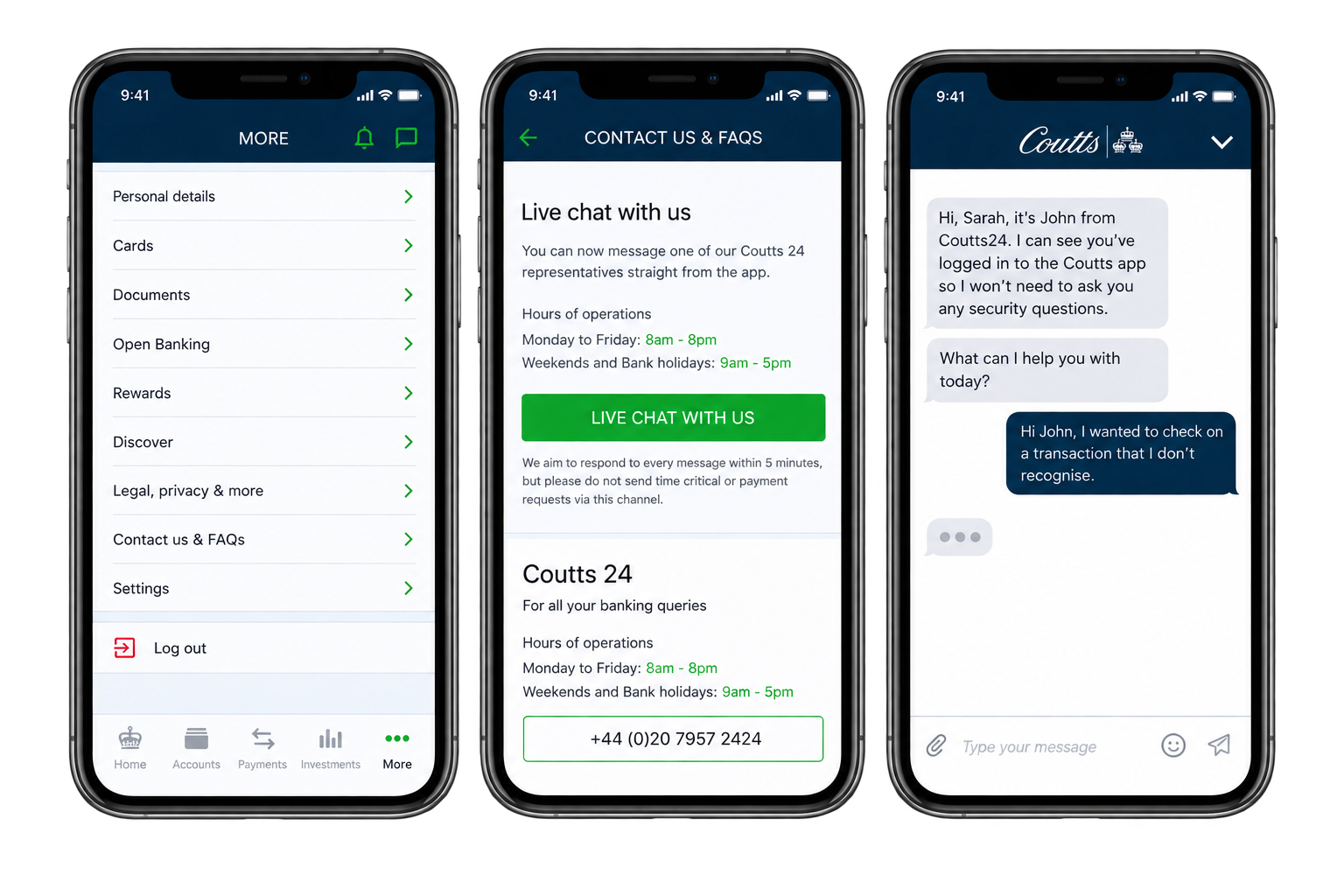
Coutts customers already had several ways to get help. Live chat introduced another — but adding a new support channel could easily add more complexity rather than less. The challenge was to make chat easy to find when customers needed it without getting in the way when they didn’t. I explored how live chat could fit naturally within the existing mobile banking experience and navigation.
PUTTING HELP WHERE CUSTOMERS NEED IT
Rather than relying on a single entry point, I designed two ways for customers to reach live chat.
Customers could find it within Contact Us when deliberately looking for support, or launch chat directly from most screens within the app when they needed help in the middle of a task.
Help became easier to reach without making the rest of the banking experience more complicated.
Flexible Mortgages
Role: UX Designer
Team: New Business Propositions
Focus: Making a complex mortgage concept easier to understand and use
MAKING A DIFFERENT KIND OF MORTGAGE UNDERSTANDABLE
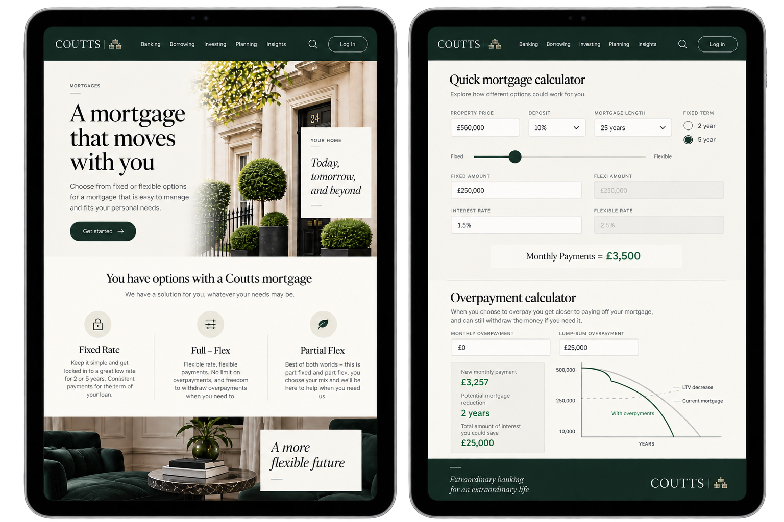
The New Business Propositions team was exploring a flexible mortgage that would allow customers to make overpayments — and potentially access those funds again later. It was a powerful idea, but not necessarily an intuitive one.
Customers needed to understand what they could do, how it would affect their mortgage, and what would happen if they changed their mind later. I created a prototype to turn the concept into something customers and the business could see, explore, and evaluate.
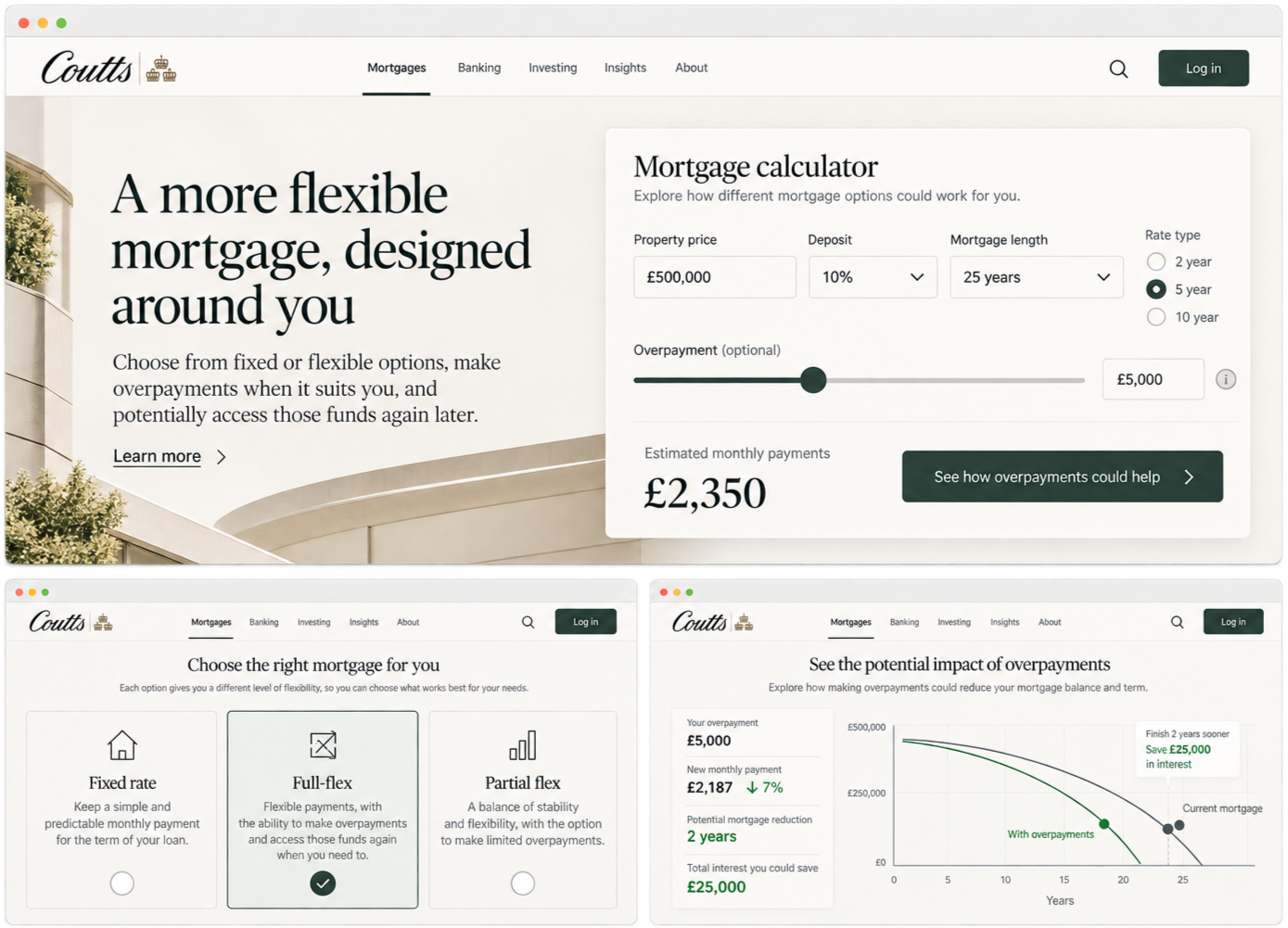

TURNING THE CONCEPT INTO A JOURNEY
I mapped the key interactions across the mortgage experience, including:
Making an overpayment
Understanding its impact on the mortgage
Withdrawing money from previous overpayments
The journeys also needed to account for more complex scenarios, including changes to a customer’s loan-to-value band.
Mapping the experience made the underlying complexity visible to the team — so it could feel simpler to the customer.
MAKING THE IMPACT OF EACH DECISION CLEAR
I translated the journeys into detailed mobile screens showing how customers could make an overpayment or withdrawal and review the implications before confirming. The experience was designed to answer the questions customers were most likely to have:
What am I doing?
What will change?
What happens to my mortgage?
Can I access this money again?
Making those consequences clear helped turn an unfamiliar financial product into something customers could more easily understand and control.
OVERPAYMENTS
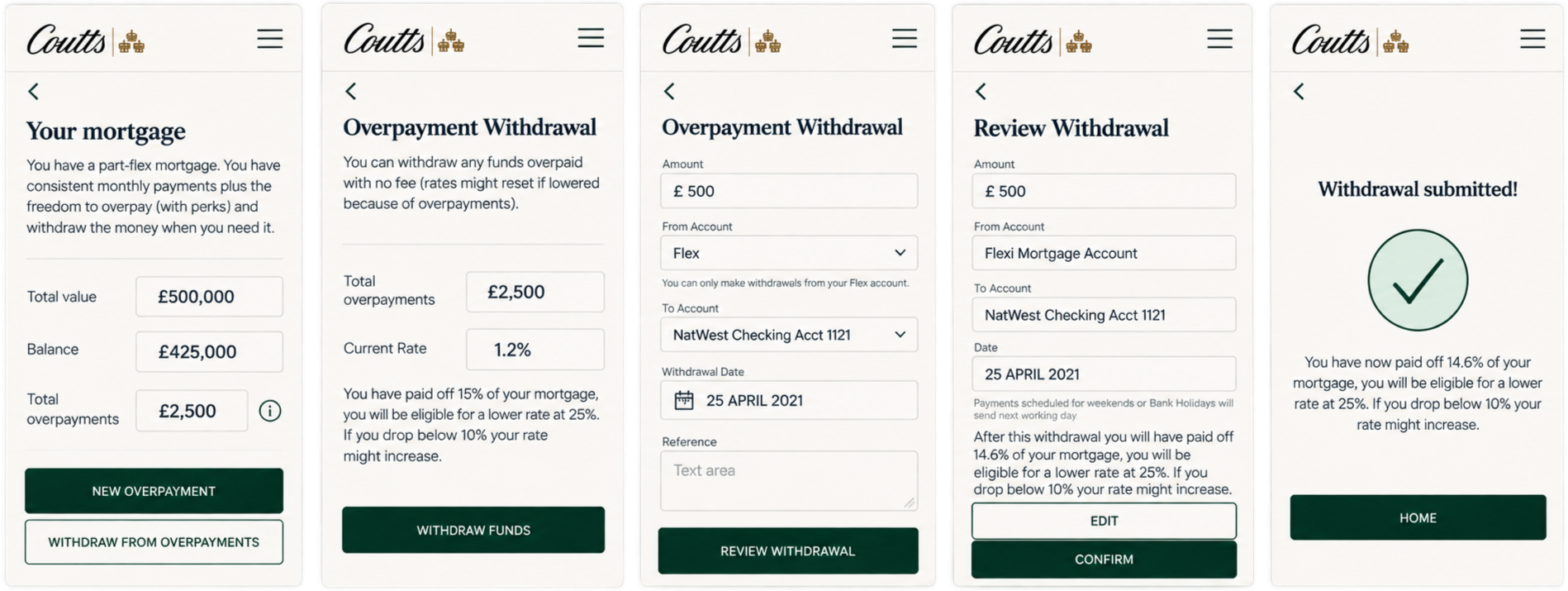
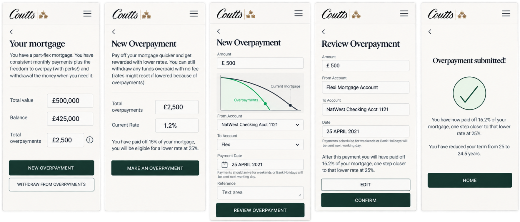
WITHDRAWALS
CONCEPT VALIDATION: MAKING AN ABSTRACT IDEA TANGIBLE
The prototype gave the New Business Propositions team something concrete to explore rather than discussing the mortgage concept only in the abstract. It helped the team evaluate the proposed experience, understand how the different journeys would work, and test the concept before moving further into product development.
A complicated financial proposition became something people could see, use, and understand.
THE THREAD ACROSS THE WORK
Across currency ordering, live support, and flexible mortgages, the challenge was different — but the design principle was the same:
Take the complexity inherent in private banking and keep as much of it as possible away from the customer.
The result was clearer transactions, easier access to support, and financial concepts that were easier to understand and act on.
Complex banking. Made simpler.