Webcredible (UX Agency)
Grainger (Client)
UX Research & Strategy · Information Architecture · UX/UI Design · Responsive Design
Choosing a home isn’t just about the apartment. It’s about imagining the life that comes with it.
For Clippers Quay, a new build-to-rent development near Manchester, prospective residents needed to understand more than floorplans and prices. They wanted to know what the neighborhood was like, how long their commute would take, what amenities were available, and whether the development would fit the way they wanted to live.
As a UX/UI Designer at Webcredible, I used customer research to shape the information architecture, journeys, and digital experience for the site. The goal was to help prospective residents answer a much more human question: Can I picture myself living here?

UNDERSTANDING WHAT “HOME” REALLY MEANT
Customer research helped us understand who was considering Clippers Quay and what mattered most when choosing where to live. Several priorities stood out:
Location and commute
People cared about nearby activities, transportation, and how easily they could get to work and other destinations.
Price
Affordability was one of the biggest factors when comparing rental options.
Amenities
High-speed Wi-Fi, pet-friendly policies, laundry, gardens, parking, and cleaning services could all influence the decision.
Lifestyle
Most prospective residents were younger renters, including couples, singles, families, and flat shares.
Together, these findings made one thing clear:
People weren’t simply choosing an apartment. They were choosing how they wanted to live.
ORGANIZING THE EXPERIENCE AROUND REAL QUESTIONS
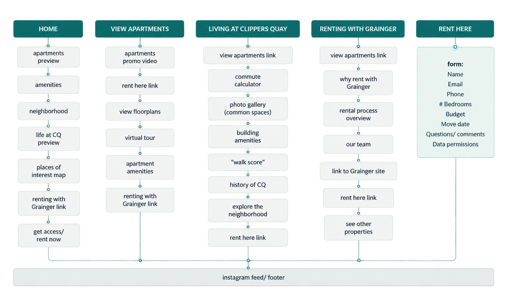
From property information, to a picture of daily life. I created the initial site map with the client, defining the content and functionality prospective residents would need. Rather than separating every piece of property information into individual sections, I grouped related content around the questions renters were actually asking. Neighborhood and building content became:
Living at Clippers Quay
Rental logistics and company information became:
Renting with Grainger
This created a clearer path through the experience — from imagining the lifestyle to understanding the practicalities of renting.
MAKING THE RIGHT INFORMATION EASY TO EXPLORE
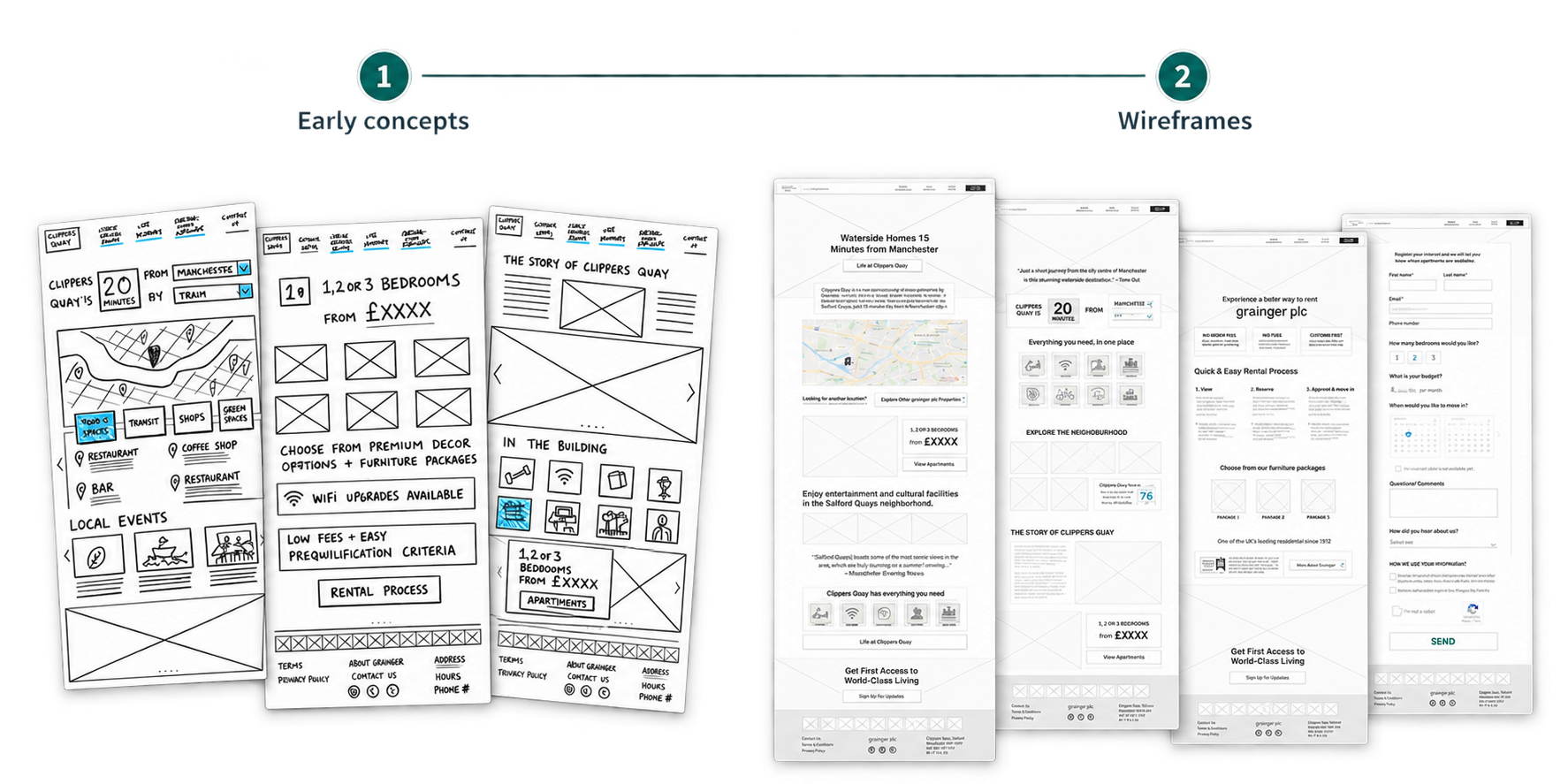
I translated the research and site structure into sketches and wireframes, exploring ways to make the information renters cared about easiest to discover. The experience brought together:
Apartments - Amenities - Neighborhood - Transportation - Rental information
Clear pathways helped prospective residents move naturally between exploring the development and taking the next step. The site needed to answer both sides of the decision: “Do I like it?” and “Will it work for me?”


HELPING PEOPLE IMAGINE WHAT’S OUTSIDE THEIR FRONT DOOR
The apartment itself was only part of the proposition. I designed an interactive map that allowed prospective residents to explore nearby restaurants, shops, services, and transportation. Instead of simply telling people that Clippers Quay was in a good location, the experience helped them see what everyday life around the development could look like.
The neighborhood became part of the decision.
MAKING THE COMMUTE FEEL REAL
Research showed that commute time was a major consideration. I designed a commute calculator that allowed users to explore travel times to popular destinations using different modes of transportation. This turned a generic location into something personally meaningful:
How long would it take to get to work?
Could I bike there?
Would this location fit my routine?
The experience helped renters move from understanding where Clippers Quay was to understanding what living there might actually feel like.
BRINGING THE NEIGHBORHOOD INTO THE EXPERIENCE
HELPING RENTERS TAKE THE NEXT STEP
Once prospective residents had explored the property, neighborhood, and commute, the experience needed to make the next step equally clear.
I designed straightforward calls to action and an interest form that allowed renters to move naturally from exploring Clippers Quay to expressing interest.

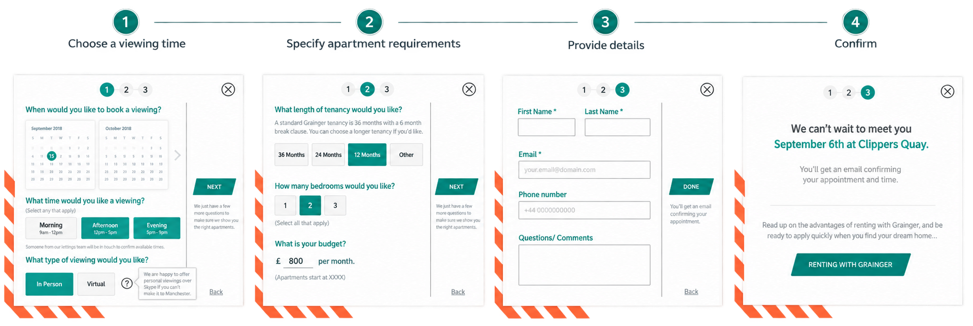
As part of the future-state experience, I also designed a guided viewing journey. The process was designed to make arranging a viewing feel simple while also giving the team useful information about each prospective resident’s needs.
Designed for life on the go
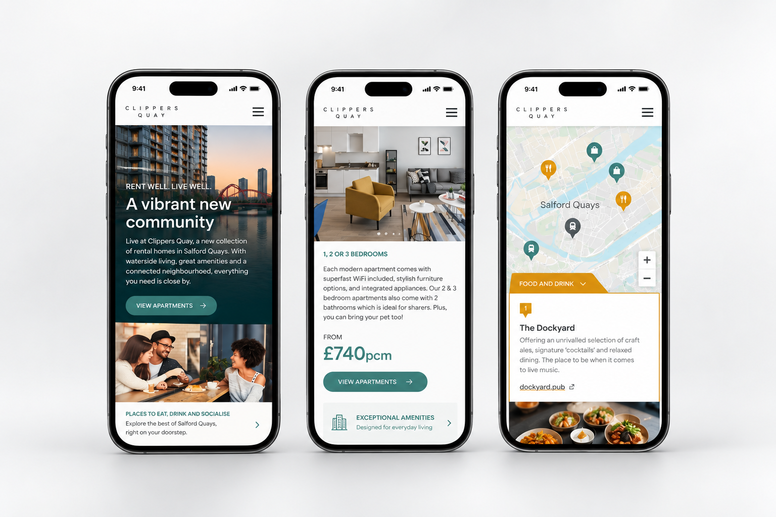
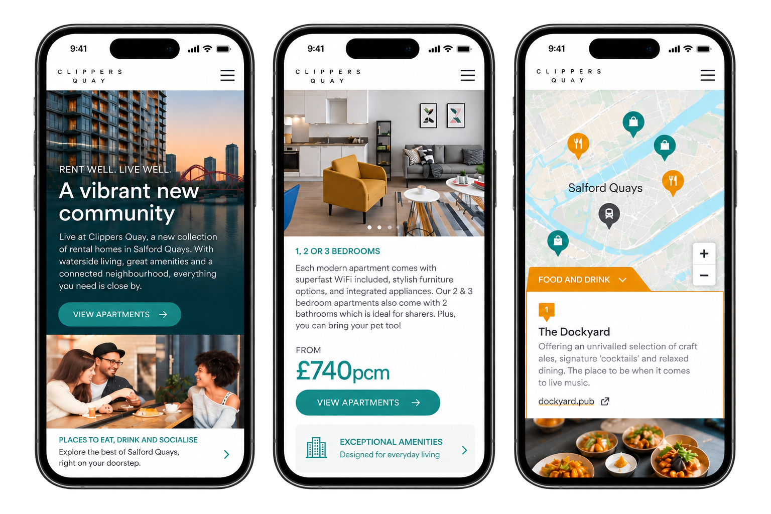
Research showed that most target customers would likely view the site on mobile, so the responsive design needed to deliver the full capabilities of the desktop experience while feeling seamless and easy to navigate on smaller screens.
I designed a clean, intuitive mobile experience with simplified navigation, clear calls to action, and easy access to key information — from apartments and amenities to the local area and transport links.
LAUNCHED EXPERIENCE
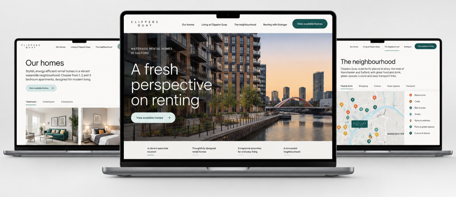
The Clippers Quay site launched as a responsive digital experience bringing together the apartments, amenities, neighborhood, transportation, and rental process. I worked with the team to translate the research, information architecture, and interaction concepts into the final desktop and mobile experience. The result gave prospective residents multiple ways to understand not only what Clippers Quay offered, but whether it felt right for them.
Not just a place to rent. A life they could imagine.